Settle is a digital platform that helps people apply for refugee status in Canada and eases the transition.
01. Our Approach
The entire process in which a refugee would apply for refugee status in Canada was far too big of a task for us to take on. We evaluated the many different phases and situations that a refugee would go through in order to be accepted and narrowed our focus onto 3 different openings.
Opening 01: Onboarding Services
We began to think about how a refugee is expected to arrive in a new country, with or without their family, and start a new life. How can we provide a service to help them access healthcare, employment services, alleviate language barriers or even connecting with a new community?
Opening 02: Tools for Volunteers
Reframing the idea of providing an information service for refugees, we realized that by providing community members with the appropriate tools, we could engage the community and facilitate interaction between them. How can we spark a sense of community and focus on welcoming a group of people into a new environment?
The opportunities for us to help are endless but we ultimately decided that we needed to solve a problem that was “low enough on the tree” and had a scope that was manageable within the 7 week long timeframe that we were given.
The Opening
Rather than focussing on how we could improve the experience after becoming a Canadian citizen, we looked at how we could make the process of becoming a citizen easier. We identified that the biggest struggle that applicants face is the complexity of filling out the government forms required to gain citizenship. How can we solve some of these issues without reinventing the application process?
As most people have experienced it at some point, filling out forms is difficult; filling out government forms is even harder. In order to understand the complexity of the forms and identify any major painpoints, we printed out the package and began to dissect it. We quickly realized how many repeated questions, redundancies and unclear instructions there were, all we could say is that it doesn’t have to be this way.
Designing for People, not Users
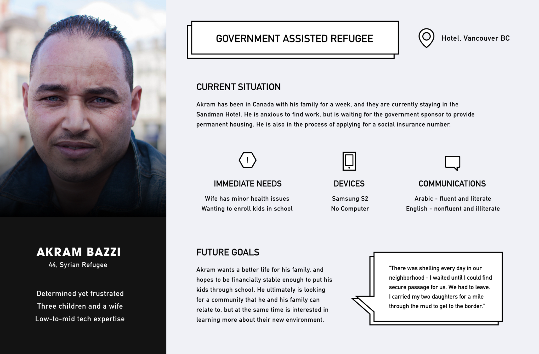
A constant principle that we referred to throughtou the project was that we weren't just designing for "users", we were designing for people in potentially sensitive situations. The number of different situations people may be in when needing help applying for refugee status are endless. How could we narrow in our thinking and design for a specific use case? We created personas for individuals who’s situations range from applying for refuge after arriving in Canada to someone applying remotely from a refugee camp in Jordan. What challenges do they face?
We began to map the process from starting the application package to getting accepted or denied.
It was important to identify the different stages, the thought process, emotional state of the applicant, and any external actors that will be needed in order to complete the application. By identifying frictions throughout the process, we were able to focus on 3 major problems:
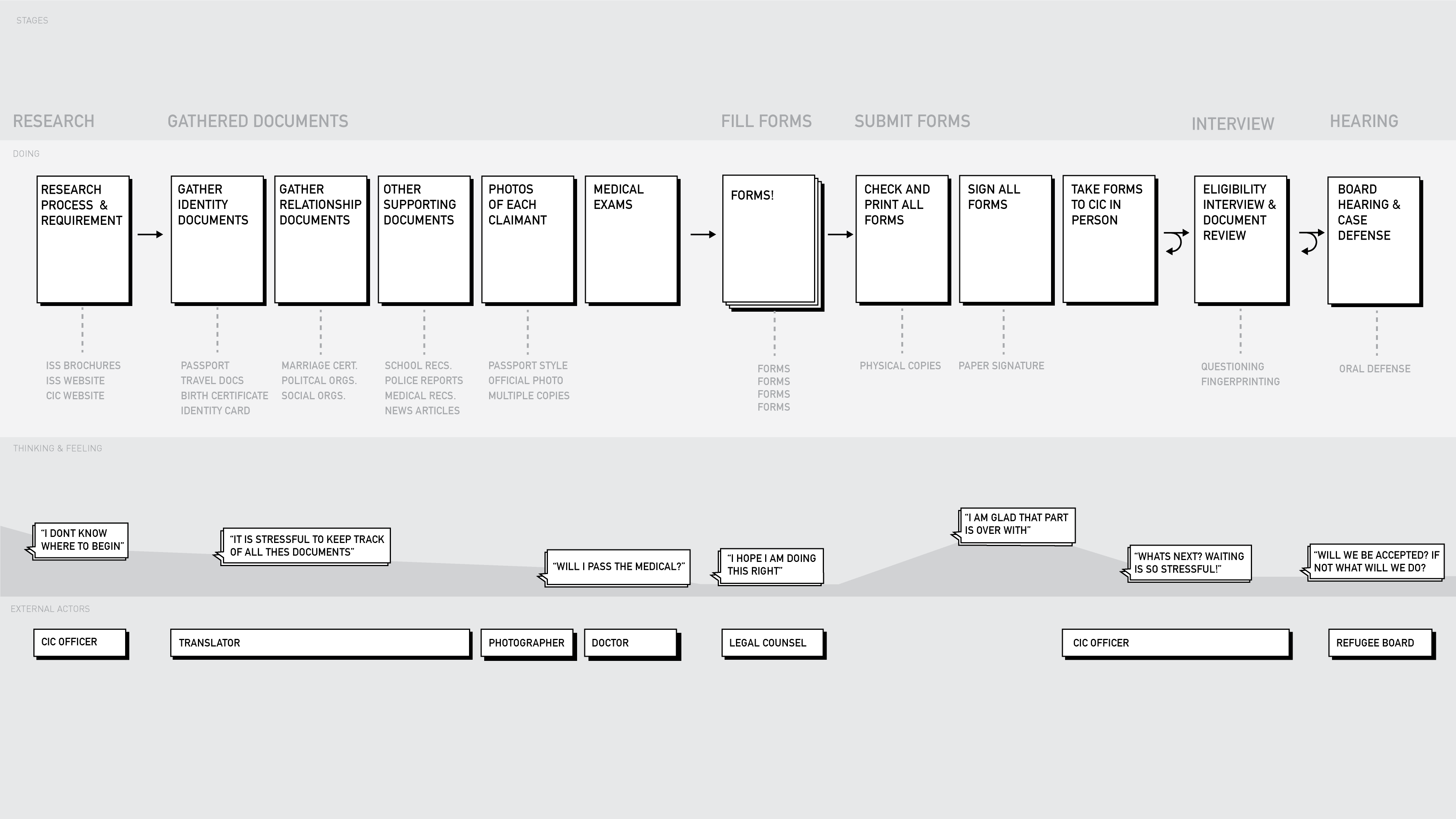
Above all, we needed to eliminate some chaos from this process. The sense of where one forms ends and the other begins is lost.
"A form doesn’t have to be complex to be credible."
Creating the “Happy Path”
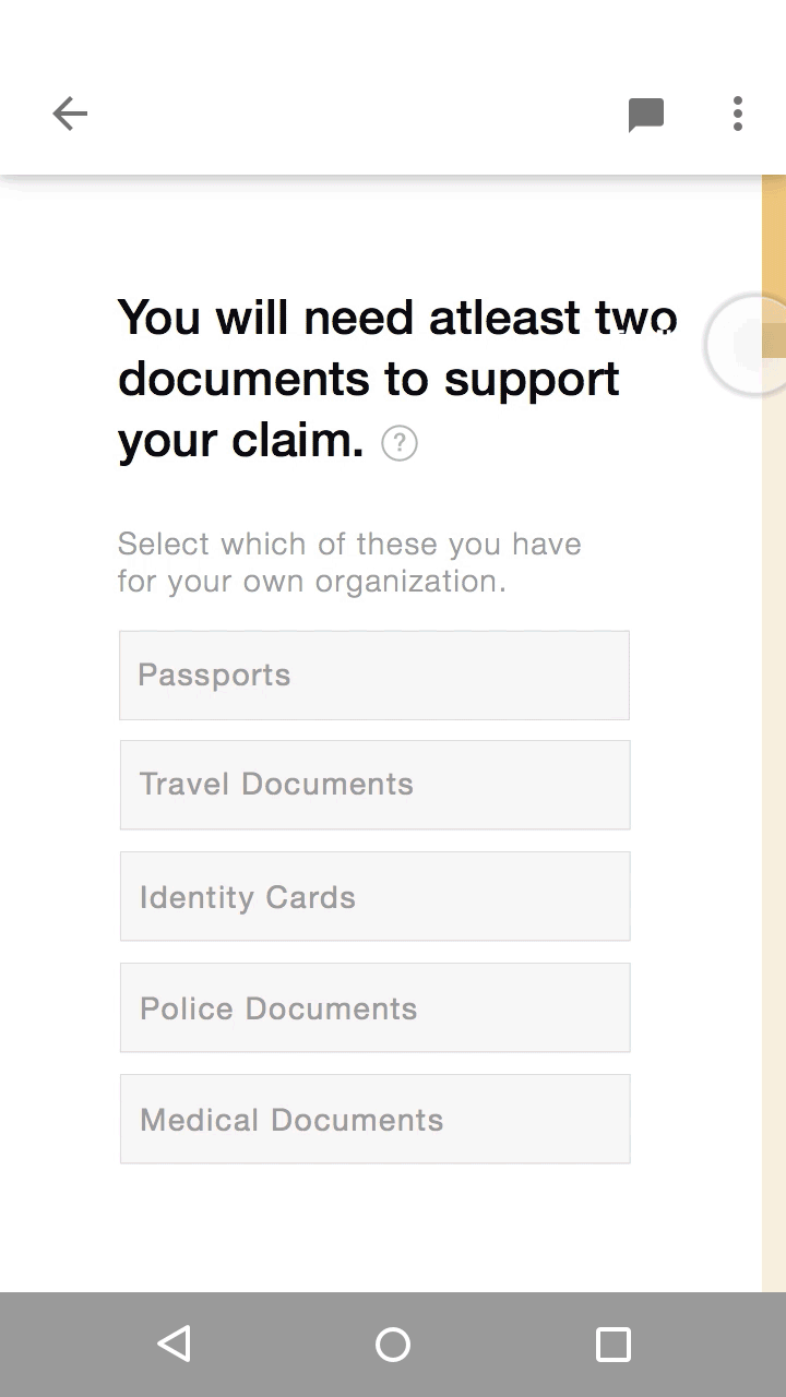
Respecting the existing government required questions, we were limited as to how we could simplify this process. Simplifying the interface and focussing only on one question at a time may reduce the number of errors or misunderstandings and ultimately save time but we asked ourselves, “how else can we make this process more efficient?”. We created the “Happy Path”, the most simple route from start to end. Settle eliminates any repeating or redundant questions by recognizing where these questions are required and auto-filling them on future forms. For example, you only have to fill out your name once.
02. The Form
Onboarding
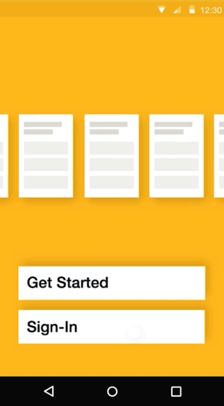
From the moment the app is opened for the first time, we wanted to reinforce the idea that this platform acts as a guidance tool to help the applicant finish this gueling process.
During this onboarding process, Settle introduces the mental model of the form-filling process and quickly prompts them to begin filling out basic information to demonstrate how the interface works. Basic information such as the applicant's name, birthdate, country of origin, and contact information is requested. The information entered then autofills any forms requiring personal information; the applicant has already began the process of applying for refugee status.
Navigation Exploration
When designing the home navigation, it was important for us to communicate and encourage progress. We decided to create 2 different directional interfaces and do multiple rounds of A/B user-testing on users with varying levels of mobile-app familiarity in order to find out which one was more successful.
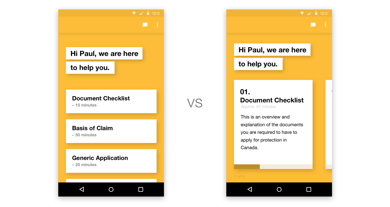
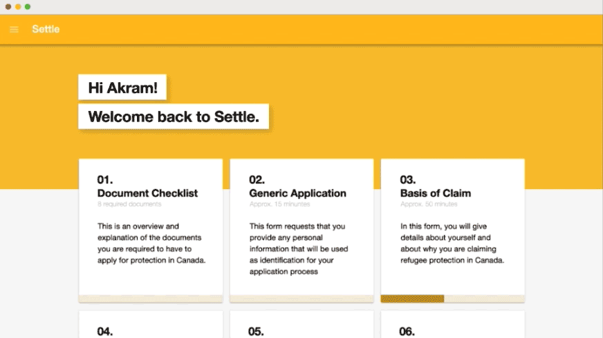
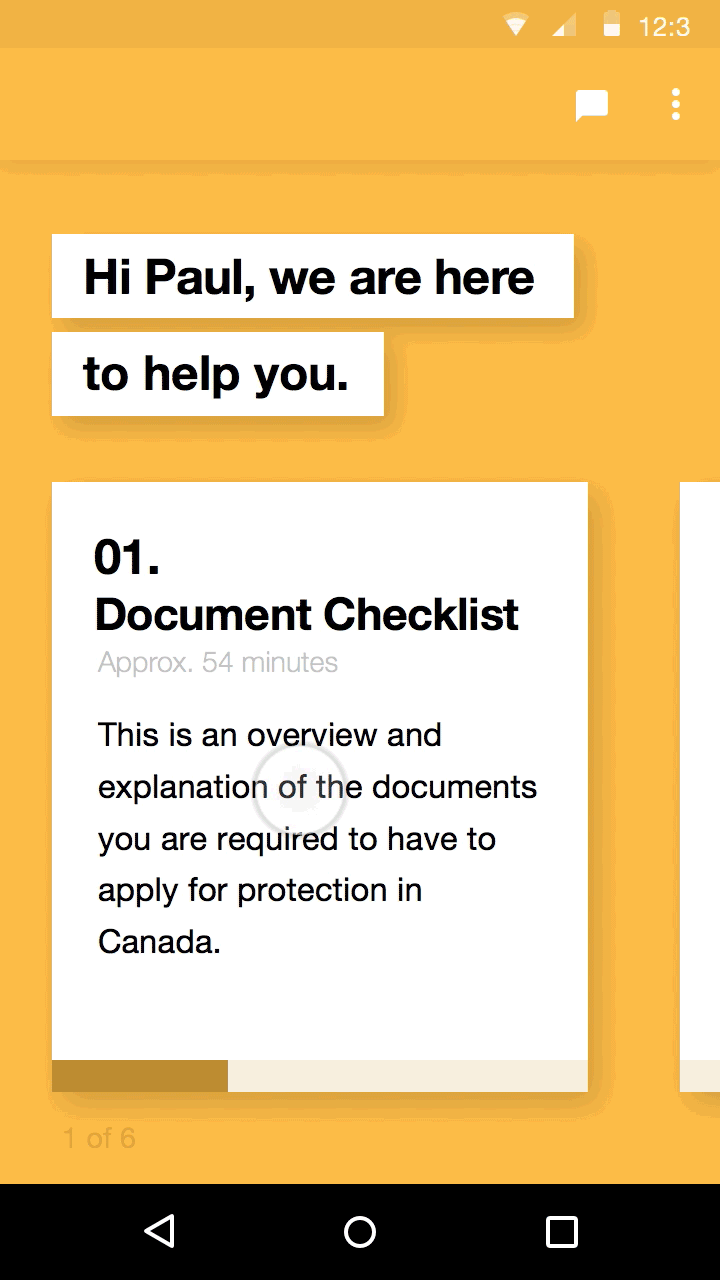
Vertical Card Navigation
Using a vertical style navigation with smaller cards, we found that users were able to identify how many forms were needed to be completed very quickly got a preview of how long each of the forms will take them. A major friction that was identified through testing was that the applicants were not given enough contextual information about each form and any required documents that may be needed to complete them. A secondary concern that arose after user testing was the longevity and how this interface would evolve over time. We discovered that as forms were completed, when re-opening the application, the viewport would be saturated with completed cards.
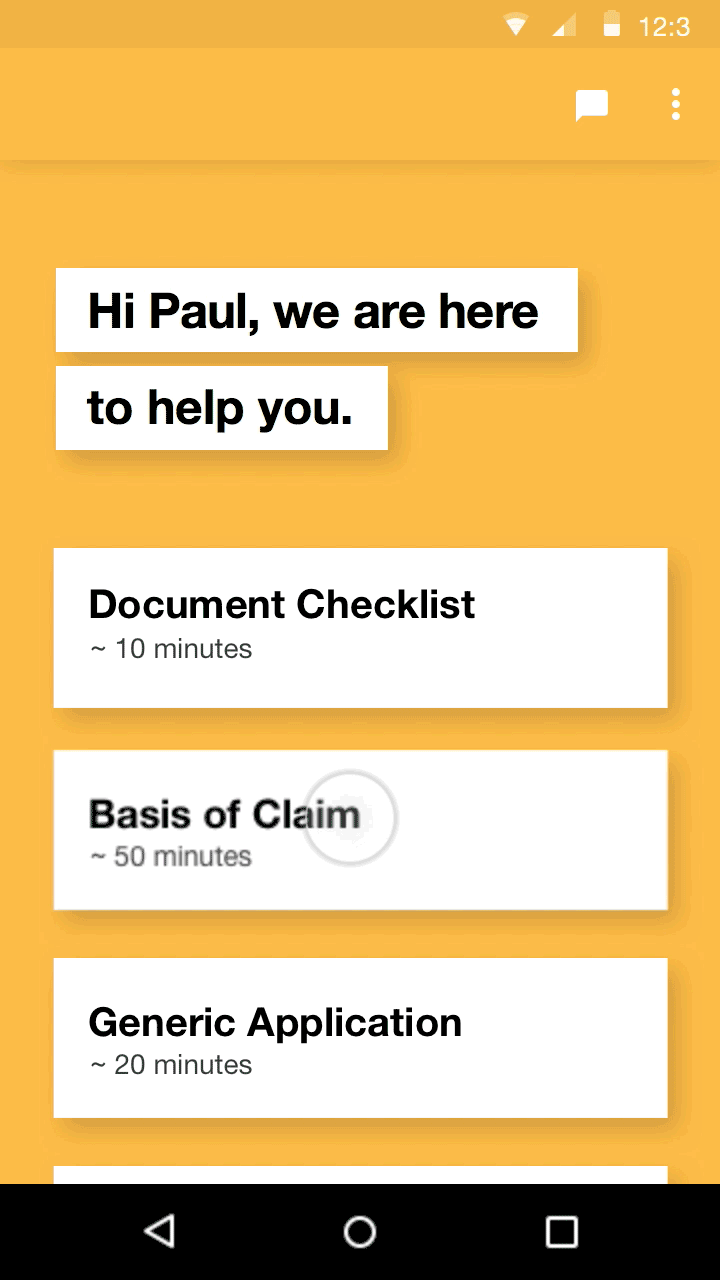
Horizontal Card Navigation
The second navigation style that we tested was a paginated, horizontal scroll with large cards. Our testing showed that the users appreciated the short description on each card and was able to understand what was going to be asked of them before starting. Having a single card view, we found that people were able to focus on one form at a time and perceived it as less intimidating.
Filling out a Form
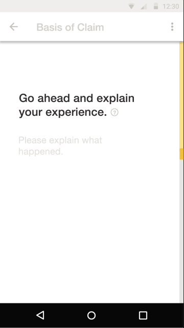
While filling out a form, Settle provides help when needed and provides contextual information at high-risk points in the process.
Settle provides the user with a broad overview of the form-filling process and quickly prompts them to begin filling out basic information to demonstrate how the interface works.
Filling out a form
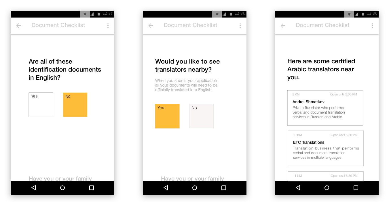
Getting Help
Often clarification or assistance is needed in cases where English is not the applicant's first language. Settle offers a detailed description of the question, as well as a way to chat with a government representative who can help. If that’s not enough, a collaborative link to the form can be sent to the applicant’s legal counsel.

Filling out a form
Prompting Answers
Most inputs are universal to any language. However, paragraph sections can be tricky because they are longer and must be written in English. To help, Settle provides simple writing prompts that appear sentence by sentence. This facilitates the writing process as well as references key information that may help the application get approved.
Filling out a form
Navigating Through Forms
Sometimes people don’t fill out forms linearly. To accommodate alternative needs, we introduce a minimal scroll bar that displays and updates the progress made within a form. To skip forward in the form we designed a scrubbing affordance, allowing the applicant to get a preview of upcoming questions and friendly to non-linear form filling behaviours.
Printing & Submitting the Application
Depending on the resources a refugee may have, we wanted this service to be available on both mobile and web. Refugees are constantly having to adapt to new situations. In order to address this, we created a seamless experience when switch between platforms; they are able to pick-up right where they left off.
Once the applicant has completed all of the forms, Settle indicates that the application package is ready for printing. To reassure that all of the documents are being formatted correctly, the user is able to select a form and view the pdf version.